


Pencil, circa 1855. National Portrait Galler, UK.


The extremely prolific English architect,Digby Wyatt was the younger brother of another, much less interesting architect, Thomas Henry Wyatt and related to the huge Wyatt dynasty. He was Secretary to the Executive Committee for the Great Exhibition (1851) and “orientalized” the architectural detailing of London’s Paddington Station, London (1852–4), for Brunel. He designed the polychrome Addenbrooke’s Hospital, Cambridge (1863–5), collaborated with Brunel on Temple Meads Railway Station, Bristol (1865–78), and designed (with George Gilbert Scott) perhaps one of the finest examples of Victorian Renaissance Revival; the interior and Durbar Court, India Office, Whitehall (1867–8).
Digby Wyatt was informed and enthused by the designs of past centuries. He wrote Geometrical Mosaics of the Middle Ages (1848), edited Industrial Arts of the Nineteenth Century (1851–3), and published many other works. When the Crystal Palace was re-erected at Sydenham, Wyatt acted as Superintendent of the Fine Arts Department, and, with Owen Jones, designed the various ‘Courts’ demonstrating various periods and styles. One of his most exotic interiors was the spectacular billiard-room at 12 Kensington Palace Gardens, London (1864), in the Moorish style. He was a pioneer of the Renaissance Revival, the first Slade Professor of Fine Arts at Cambridge (1869), and a prolific author. His Rothschild Mausoleum in the Jewish Cemetery, Buckingham Road, West Ham, Essex (1866), a domed building on a circular plan with Renaissance and Baroque detail, is an example of his ‘mixed style’.

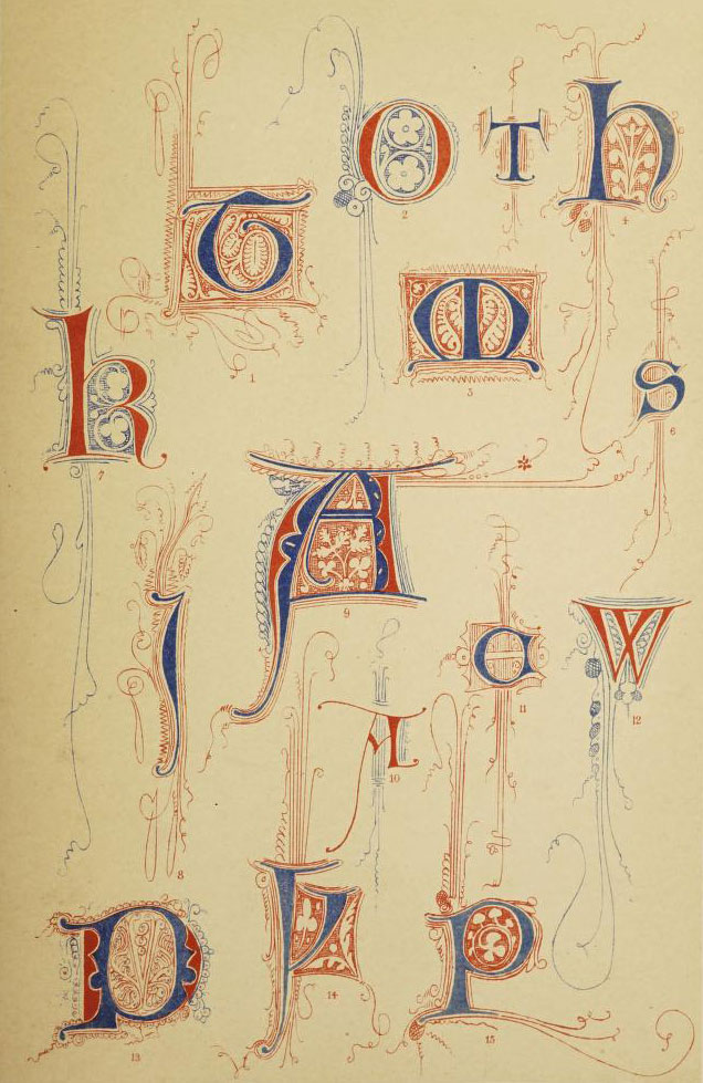
As well as enjoying the aesthetically beautiful type, it’s worth noting that for all the endless doodling with embelishments and illuminations that type design didn’t really move on enormously for a thousand years. It wasn’t until 1816 that William Caslon IV designed thefirst sans serif typeface,Caslon, though at the time it wasn’t widely accepted or popularized. Sans serif had been around for 50 years when Digby Wyatt published The art of illuminating so he was either unaware of it or deliberately ignored it for inclusion in his book. When modernism emerged at the turn of the century, ushering in the design concept of form following function, sans serif exploded. Sans serif type did for typography what punk did for music. It was never the same again.
6th Century Letterforms

7th Century Letterforms


8 th Century Letterforms


9th Century Letterforms


10th Century Letterforms

11th Century Letterforms

12th Century Letterforms


13th Century Letterforms


14th Century Letterforms


15th Century Letterforms


16th Century Letterforms
